Find Your Perfect Font
This is the second in a series of articles to help you with basic marketing design.
In the first article, we looked at how to choose a color palette. This article will discuss fonts and in the next, we will dive into the world of High Definition photos.
The goal of these articles is simple. Setting a proper design foundation is essential when you plan your first marketing piece, are creating a website, or building your brand. Therefore, I want to pass on the tools I use to make the world a little more design friendly.
Before moving to finding your perfect font let's quickly examine a few important definitions.
- Typeface: what we normally call "font" is actually a typeface, for example. I am writing in the typeface "Raleway." Other typefaces include Arial, Helvetica, and more.
- Font: most people use the term font when in reality font refers to the weight, style, and size of a typeface. For example. this is the typeface Raleway in a bold font. I am not a snob when it comes to the difference (just look at the title of this article), yet there are some who will look down at you if you are unaware of the distinction.
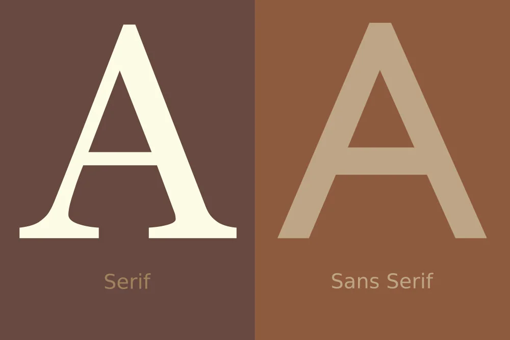
- Serif: see below how the serif font is not straight at the base of the "A." Those protrusions are called serifs and have traditionally been thought of as easier on the eyes. Next time you see a newspaper in print you will notice the serifs which help your eyes move across the page.
- Sans Serif: see below for an example of sans serif. Many contemporary typefaces are sans serif and are thought to be friendlier to read on websites. I prefer sans serif because I like clean lines.
Those are the very basics that are needed to get you started on understanding typefaces.
From now on we will use typeface instead of font, the article title was just to get you to start reading :)
If you become interested in typography I highly recommend watching the documentary Helvetica which describes the history of typefaces along with advanced ideas.
Now that you know the basics, where do you actually go to find great typefaces?
Do not say your standard list of typefaces on your computer, those are common and will not let you stand out.
Instead, you can search the web for amazing typefaces that will allow your personality to shine and show off what you are promoting.
Since this is a beginner article we will go to the site which, in my opinion, is the easiest to use: Google Fonts. Not only is the site beautiful, it is also easy to navigate and you can download thousands of typefaces for free.
Before you determine your preferred typeface, think of how you want to be perceived. Do you want a bold typeface that is large and pulls in an artistic crowd? Do you want something a little crazy to match your personality? Or do you want a clean typeface which shows off your classic nature?
Take some time to look through the different options before making a decision. Fair warning, searching typefaces is equally fun and addicting. One late Sunday night my wife found me on my computer and I quickly shut it, was I look at something dirty? No . . . I was downloading typefaces . . . again . . . at that moment I knew I was addicted.
Once you have found your perfect typeface, how do you download and start using it? We will do a walkthrough on Google Fonts with the Raleway typeface.
- In the upper right-hand corner is a search bar, type in "Raleway."
- The typeface will appear on the left, click on it to enlarge details of the typeface (see below).
- In the description you will find useful information that immerses you in the typeface, I told you it would be addicting as now you might want to look up a hundred more!
- We will fight the temptation and click on "Select this Font" in the upper right-hand corner.
- At the bottom of your screen, you will see a bar that says "1 family selected," click on the bar.
- There are some advanced features we are going to bypass, for us let's download.
- In the upper right-hand corner of the new box you will see a downward arrow, click on it to download the typeface.
- It will download as a zip file.
- Open the zip file when it is fully downloaded.
- When you open the file, you will see many options starting with "Raleway-Black," this refers to the typeface and font, i.e. Raleway is the typeface and Black is the font (Black is thicker than bold).
- Click on Raleway-Black, a new window will pop up with "The quick brown fox jumps over the lazy dog 1234567890" in multiple sizes, this is to show you each of the main characters. Notice A-Z is in the stock sentence.
- Simply click "install" at the top of the window.
- Now you are ready to use the typefaces in Adobe, Office, and more!
Once you start downloading typefaces the above steps will become second nature. You will download hundreds of typefaces in an afternoon and be ready to start your design work.
Keep in mind you want to stay consistent, so even if you download a hundred different options, pick the one or two (heading and body text) that will be part of your design.
Now you have the basics of color palettes and typefaces. In the next article, we will move to finding stunning photos that will stop people and leave them in awe.
If you would like to take your marketing to an even higher level, feel free to reach out and let Elisha Consulting help.


